


 Previously in Graphic Design we were allowed to create a personal logo that represented who we are and our personalities. While it was really fun and interesting to go through the process it was also complicated to get the shapes square and exactly where you wanted them. These pictures (in order of when created) is the thought process that I went through after I created 15 ideas for a logo.
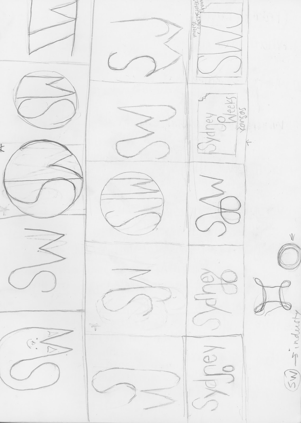
The first thing we had to do was create 15 sketches of 3 different logos we were thinking of. After we did those we started putting our favorite ideas into Illustrator. I chose to incorporate my initials into a circle because a circle represents organization and I am a very organized person. Then I changed the colors and added design elements to make it more appealing. Once I had the shape I liked for sure, I made the colors more subtle and added a wordmark for business cards or notepads. The font that I found to use for my wordmark was Eryx Rennie Macintosh.
During this project we had to ask each other for help to see if our logo would appeal to others and I think I did a really good job about collaborating and communicating with others' and Mrs. Lofquist about things I could improve on and things that I should keep the same.
No comments:
Post a Comment