Throughout the semester, we have had a total of 4 different assignments. We had to do an ONW procedures video, a ONW Now long project on a certain person we were assigned in our class and had to learn how to properly set up a microphone and an interview. Another project we had was to film the Blood Drive that STUCO holds every year. It was interesting for me because I do not like blood and especially not needles. When we got there I had no clue what it would look like so I freaked myself out more than I needed to be. Once we began interviewing people and getting B-Roll I was actually quite interested in the subject, not necessarily the Blood Drive, but doing live coverage of events. Our final project was an actual episode of ONW Now including a theme, many stories, a Gameday Northwest, an intro, and scripts. That was probably my favorite project by far.
Overall, my favorite project was probably the ONW Now project we just finished. This has always been my "dream" I guess, since I saw my first episode last year. When I heard that we got to produce an episode of our own, I was ecstatic. I thought it was really fun being an anchor because we got to create our own scripts and we were the people that created the tone the viewers would feel throughout the episode. It was also really complicated, however, because my partner (Mallory) and I chose the hardest story I would say because we chose Cram and Cocoa which was a story we had to film and edit the night before the package was due. When we were editing the video, we were the only ones in the classroom so it was fun to be able to not have any interruptions and to be able to do what we wanted since we really could be there for however long we wanted. While we had some problems with having to finish our whole project in one night, it was interesting to see a glimpse into what our future might hold for us.
One of the key points throughout this semester was probably having to record the Blood Drive. When I was younger I had to get my blood drawn which I had never done before so considering how much I hated needles in general beforehand, I was terrified. Once the had the needle in my arm, they couldn't seem to find my vain so for the next 15 minutes they were digging a needle into my arm which, as you can guess, hurt extremely bad. Right that instant, I knew that I would forever hate needles and blood so, when we were assigned the Blood Drive, I was not happy. When we got to the venue, I was scared because I had no idea what it would look like. Although, at the beginning, it was very nerve wracking; I got over my fear and ended up producing quite a good and informational video.
If I were to change anything to make it better, I would change my hobbies video to get more B-Roll. While I had a quality video and story line, I could definitely have more video to show over my voice-overs and interviews. My video turned out okay but it would've been a lot cleaner and better quality if I had created a longer story with more interesting video.
All together, I am going to try and get more video and manage my time better this next semester. I thought it was interesting to be able to have two different teachers who had two different ways of teaching because it taught us how to adapt to new things and create good videos the way that teacher wanted it specifically. I'm excited to see what this next semester had in store and to make amazing videos with our new teacher!
Sunday, December 20, 2015
Friday, December 18, 2015
Final Graphic Design Project


 This is my final Graphic Design project. We had to not only create a business card, but a pattern to go with it and we had to put our logo in it that we made in the past. We also had to use a picture and turn it into a postcard. On the bottom is a picture of Sydney, Australia which is where I got my name from. What I decided to do was take a picture and incorporate the name of the city which, ironically, is my name too. For my pattern, I decided to take the design elements from my logo and use it which turned out quite interesting I think. For my postcard, I chose to use one of my favorite quotes "It's about the journey, not the destination." I chose a picture of an infinite road with a sunset to add some color then created a sun from scratch for the back side of my postcard.

I loved this project because it allowed us to use all of the elements that we've used previously in other projects. We got to create a whole new pattern, use our previous logo, make type masks, and also incorporate Photoshop and Illustrator together. If I could change something I would probably add more things to my pattern like a gradient or other colors.
Friday, December 11, 2015
How To Tutorial


Thursday, December 3, 2015
Personal Edit

Masks
 Recently we have been using Photoshop to create masks in different layers whether it be type masks, color masks, or filter masks. In this first image we used a type mask to make the word look like it's made out of water.
 In the second and third pictures we used different layers and masks to make specific object different gradient colors.
In the fourth final image I created a mask and used a gradient over the whole picture. After that we had to make the center appear clearer than the rest.
Wednesday, December 2, 2015
Floating Mountain

Personal Logo


 Previously in Graphic Design we were allowed to create a personal logo that represented who we are and our personalities. While it was really fun and interesting to go through the process it was also complicated to get the shapes square and exactly where you wanted them. These pictures (in order of when created) is the thought process that I went through after I created 15 ideas for a logo.
The first thing we had to do was create 15 sketches of 3 different logos we were thinking of. After we did those we started putting our favorite ideas into Illustrator. I chose to incorporate my initials into a circle because a circle represents organization and I am a very organized person. Then I changed the colors and added design elements to make it more appealing. Once I had the shape I liked for sure, I made the colors more subtle and added a wordmark for business cards or notepads. The font that I found to use for my wordmark was Eryx Rennie Macintosh.
During this project we had to ask each other for help to see if our logo would appeal to others and I think I did a really good job about collaborating and communicating with others' and Mrs. Lofquist about things I could improve on and things that I should keep the same.
Wednesday, November 25, 2015
A Drip of Life
This past week in e-Comm we have been doing a live coverage story on our Student Council's annual Blood Drive. Our goal was to shoot some B-Roll of the event while also interviewing either a phlebotomist, a donor, or a STUCO member helping out.
Wednesday, November 11, 2015
Saving Lives One Drop at a Time
The scope of this project was to emphasize the blood drive in a Michigan high school specifically for a previous breast cancer survivor. They wanted to explain what their goal was when doing a blood drive, especially for breast cancer.
This video did a really good job about posing their shots, both in interviews and for the B-Roll. Another component they executed well was their B-Roll, they made sure to get plenty of different angled shots whether it be of the patients, the organizer, or the phlebotomists. They also used the 6-Shot-Sequence, the Rule of 1/3, a stable base for each shot, and well-rounded audio.
I could use a lot of the things used in this video like the different shots and set-ups of interviews and the B-Roll. Also, the angle the story was told in is a really good concept I could use. They made their angle specific to certain people so if I could find an individual story, that's what I could base my video off of.
Overall, I thought this video was very well put together between the actual video and the audio over the top. I will definitely use this video as a reference for my upcoming story.
Friday, November 6, 2015
ONW NOW Video
This project we did in class was to familiarize ourselves with having to use B-Roll and interviews in the same video to create a whole story. My video in particular was over ONW Sophomore Thomas Barnes and his incredible talent to be able to compose music. It was really interesting to be able to see what he does to get into his composing zone.
First I had to go in and get actual footage of him playing and composing music. After that I got to create my story which personally is my favorite because I get to make my own delayed and summary leads and the voice-overs in between. After we created our scripts we started to organize our clips by favoriting and keywording them so we knew which videos to use. During this we also did our voice-overs then started to actually put things on our timelines. Once we got things on we would just morph them all to make sure they transitioned well into one another and that there weren't any jump cuts.
I've learned a lot of things during this project such as how to get B-Roll for certain activities, what types of shots to use, how to use a title for an interview, and also how to use the J and L to cover up different cuts.
If I were to do anything different I would make sure that I white-balanced my camera every time I was in new lighting or location. I would also get more B-Roll of him composing and playing different things.
Other than those things I am very happy with how my video turned out and am looking forward to learning more things in AV class this year and to make more and more videos.
Wednesday, October 28, 2015
Professional Article Review: Creative Anarchy at Its Very Best
This article was about what it takes to embrace creative anarchy. It explains that rules are meant to be broken but you have to know them first. Also, that there are many problems that occur in design but the thing is that there are even more solutions to them. Finally, the article explains that it's okay to take risks and divert from the conformism of others. In this article, the author Denise Bosler tries to explain that it's okay, and many times needed, to break the rules.
Design has many different components that make it as creative as possible. One of these being rules which are needed in order for us to be able to do what we need to. While they are very important to help us stay on track, it also is important to break them at some points. They provide guidelines and basic information to make creative pieces but also can block us from being truly creative in our own ways. Design is something that needs to be pushed and so does our own creativity.
This is especially true when there are problems with the pieces you're trying to create. "Every design problem has multiple solutions," as said by Denise Bosler. Even problems need to happen in order to succeed. Design does not have shortcuts; it's either do it fully or not at all. No matter what happens, we will always be learning new things whether they be new ideas we come up with, new solutions to a problem, new techniques, or new rules. There is no way to escape rules, but there are many ways to break them. The key is to break them but in a way that it will benefit you instead of hurting you.
Denise did a great job about supporting her key ideas with a lot of detailed evidence. She also used good examples in order to further her opinion about what she believes is needed to be a successful designer. She could've worked on using less words but just as much detail to explain her main point so that it wasn't as confusing as she made it seem.
Monday, October 5, 2015
Professional Article Review
This past Thursday in Roseburg, Oregon a gunman opened fire which killed at least nine and wounded at least seven at Umpqua Community College. One student was live tweeting about the travesty while it was occurring. Kayla Marie tweeted "Omg there's someone shooting on campus," at 12:41. This caused many reporters and TV producers to attempt to get into contact with Kayla to get as much information on the shooting as possible. While reporters were trying to interview her, some journalists considered the consequences of their actions and one even thought of them as "Absolute human vultures."
The author of this article is trying to say that journalists can be rude when attempting to interview others. They show this by including quotes, pictures, and videos of the president, bystanders, and people who were affected by the event. The author is very good at explaining the travesty and quotes that are included. They aren't very good at getting to the point as much as explaining it however. Their conclusions are that reporters and journalists can be evil when it comes to interviewing and getting information on important news.
This article explains the points the author is trying to convey very well by using exact tweets by Kayla Marie and Emmanuelle Saliba, quotes by other reporters from various news stations, and also pictures taken at the scene. The evidence convinced me that reporters can be conniving and rude when trying to interview others. The applications are the photographs taken and the speech recorded Barck Obama gave to the college. Overall, this article was put together very well to get the point across about reporters.
https://www.washingtonpost.com/lifestyle/style/vultures-or-reporters-after-shooting-witnesses-hit-with-media-requests/2015/10/01/c7c53a86-6871-11e5-9ef3-fde182507eac_story.html
Wednesday, September 30, 2015
Audio Interview
This video is an interview I did with Will Vestal about a knee injury he had wand how it affected him playing baseball. It was really interesting to do an interview without video because it really helps you focus more on the actual story itself instead of thinking about getting the shots exactly how you want them. Some things I learned were how to create a cover so that you couldn't see the actual video, also how to adjust the volume levels so that they're in between -6 and -12. Another task I was taught was how to key word your videos so that you know where they need to go in the story and what content is in the video. Some things I would change were the soundbites of him answering my questions. I would've had him restate the question so that it would be more useful in the video.
Monday, September 21, 2015
Ceiling Tiles: Patterns and Motifs


Tuesday, September 1, 2015
Basic Procedures
This is a video we did in A/V about the correct ways to do basic procedures here at ONW High School. The video above, particularly, shows what you need to do if you are late to your first hour class. I hope this is informational and can help new students know what do to and where to go in case they are late to school.
Monday, August 31, 2015
Professional Project Review
This past week in class, we have been focusing on making professional videos. So to help us understand the concept of a professional video, we were to watch a video called Michaela.
https://youtu.be/7DyjEYbz8gg
This video was about an average teenage girl who has an interest in weightlifting. The video shows all different types of shots during practice with her dad and also a competition she went to. Throughout the video, however, the two main shots that appeared most were close-ups of the face and also extra-wide shots. The close-ups showed us emotions and specific details of her method of lifting which is very informational during s professional video. Wide and extra-wide shots help create the environment where the lifting is happening and also tells you who is in the scene.
If I were to change anything in from this video as if it were my own, instead of using as many close-ups and wide shots, I would've split them up between the others or at least not used as many. If I were to keep things the same, however, I definitely would've used the sequence of shots that were used during the video. Some things I can use in my own projects are to not use too many of some shots but also to make sure that I spread them out without using one after the other. I can also use the idea of the shots like the close-up of the feet/hands while she's lifting and getting her grip.
There were many good things and also many not so good things that can help me in future projects down the road. Overall, though, the video was very helpful and had a lot of information we can use during out projects.
Friday, August 28, 2015
The Beginning

Basics
This past week in Graphic Design we've been learning how to get back into the norm so we made a pencil. After we made a plain and simple pencil (with matching can) we made a personalized version of it. On my pencil I used my favorite colors; mint and grey, then for my can I used a fun and colorful.
 New
New
Once we created our own pencil and can we were told to create something new. What I did for my new object was tissue boxes. I made abstract shapes and patterns to help myself get used to illustrator again. It was really interesting to see how much I remembered from last year and to already be learning new things. 
Some new things I learned are how to use the pencil tool, how to use patterns instead of colors, and also how to use the paint bucket tool to fill in shapes. I really liked to use my imagination to create something completely out of nothing.
Reflection
If I were to change anything in this project I would've tried to make a shadow on some of my objects and also made my boxes look more 3D and a little bit more abstract and distinct from the others.Thursday, August 20, 2015
What is graphic design?
Graphic Design is a language in which we use words/art to express who we are and to convey our personal styles and techniques. Whether it's on match boxes, ceiling tiles, or tissue boxes; graphic design is everywhere. It creates a sort of timeline of where you've been in life, where you're at, and where you're going or where you want to go. Such as when you go on a vacation either your parents or yourself will get some sort of decorative item for proof you went wherever you did such as a hammock which is what I got when I went to Jamaica. The design and way the colors were weaved together was mind-blowing to think someone had made this themselves.

Here's a cool video to help understand Graphic Design a little bit more: https://www.youtube.com/watch?v=rUeiZ6c6EBw
It's amazing to think that almost everything you look at was created by a graphic designer. I never truly realized how much graphic design plays a part in how we choose things at the store or in school or even at my own house. The way the different colors, patterns, and design itself connect to the brain effects our choice when deciding what pattern we want on our tissue box or if we even want a pattern at all.

Another time graphic design has effected my decision making is when I was at a concert last month. My friend and I had been waiting for this concert for 2 years so when we got there we had to get a souvenir so when we got to the stand there were so many choices we had no idea which to choose because of all the different designs. We ended up going with the simple album cover and not the out of the box patterned shirt just because it was as loud. Graphic design is in almost every piece of clothing in your closet; the type on your T-Shirt is graphic design, the rip of your jeans is graphic design, even the tag has graphic design on it for the logo.

Tuesday, May 19, 2015
Final Project: Pencil Plus
Final Project

Graphic Design
During the Graphic Design portion of the project was when we came up with what our product actually was. It took a lot of thought and going back to the drawing board, but we eventually came up with an amazing product and great Graphic Design to go with it. I was the one who came up with the product, then I also created the banner for the website which included our group's company name; Office Plus, the logo; to the right, our slogan; Write like a pro, then our word marked logo. What I would change is the layout because it almost seems as if they all were just put onto the art board. I would keep the color scheme I used however because the contrast of the blues and yellows look great together. I will take so much from this project like how to present an idea to a client, how to work in a group with different Meyers-Briggs personality types, and just go into more depth about how to use tools for every aspect of eCommunication.
Video
The Video section of our project required a lot of imagination and ad-lib. It took us a while to come up with a solid commercial, but I believe it turned out amazing. I was the "Pencil Fairy" during the commercial who gave the student (Mallory) the Pencil Plus to solve her spelling problems. My video also was the one we ended up using for our website. These characters fit Mallory and I very well because she is not the greatest at spelling and I am a very enthusiastic person so playing a fairy was not a problem for me. If I were to change anything I would've made my music/sound transitions smoother because they were a little bit choppy. What I would do the same is keep our actors/actresses and have Brady direct too because he did an amazing job of getting the shots exactly where they needed to be in order for them to look right. Overall however, I think our commercial fit who we were as a group and it turned out to be spectacular. This widened our horizons about how to be creative while coming up with an amazing, unique commercial.

Animation
The Animation part of our final project was the last thing we did. At first we were a little confused on some things, but once we got together as a group and talked about it we figured it out. We did animation during the 1st quarter so it was a little bit hard to remember some of the tools we had to use and we had to get used to the equipment and Sketchup which was semi-hard at first but once we figured it out, we dove right in head first. For the animation I was the one who created the 3D text that was inputed into the whole animation. It may not seem like it's that hard, but for our specific 3D text I put our work mark and our logo into it so I created the words, then the +, then finally I created a 3D pencil. This was the most complicated part because you had to get the proportions and spacing and rotation for it and the words. If I could change anything for the animation I would've placed the 3D text in separate places and probably on the wall so it didn't look so random. I would keep our product placement and our setting because it fit our product and the idea for it very well. During this part of our project, we learned how everyone has a different talent and when you use everyone's different talents together, it can turn into something amazing.Thursday, April 23, 2015
Pencil Plus Commercial
The Pencil Plus
Our product is called the Pencil Plus. It is a pencil that can do three different things to help you right like a pro. You can speak into it to figure out how to spell a word, it will detect if one or more words are incorrectly spelled, and also it can correct any miss spelled words. The target audience for commercial, was for any student who is struggling with spelling. Just one she thinks there's no way for her to ever get a good grade on an essay, the "spelling fairy" helps her by showing her that there is a way and that way is the Pencil Plus. I believe our product could truly help many students in the future and our commercial has a different perspective on the plain commercial by adding a relatable story with some humor snuck in as well. We hope to help students and any writer anywhere; Write like a pro with the Pencil Plus.
Thursday, February 26, 2015
Photoshop Projects

Project 1:
A few techniques I used during this project were how to use the opacity and hue to make a picture appear lighter. Another focus was on layering pictures and backgrounds so it's easier to move one without moving the other. What was challenging was figuring out how to fit the lettering so that it look how I wanted it to and so it didn't look non proportional on all sides.

Project 2:
Some main tools that I learned how to use are the clone stamp and the magic wand. These helped me select the exact part of the butterfly that I wanted to then fill it with the color I desired. The clone stamp helped me create the effect of the butterfly actually flying. Some things I had trouble on were getting the edges of the butterfly right so that they weren't too small or too large.

Project 3:
During this project we learned how to create gradients and using the mask tool. We used the mask tool to put the NORTHWEST on top of the school layer then gave it a gradient with our school's colors. Problems I had were, again, getting the type the size and shape I wanted. Project 4:
In this project we learned how to use the magnetic lasso tool, went into more depth with the mask tool and how to create a fading effect on pictures. With the mask tool we could paint with black on a white canvas which gave the pictures a softer, rounder look and helped it look like the pictures faded into the sky. Another thing we learned how to do was delete things then replace them with whatever the things around them looked like and make it look real.
Tuesday, February 3, 2015
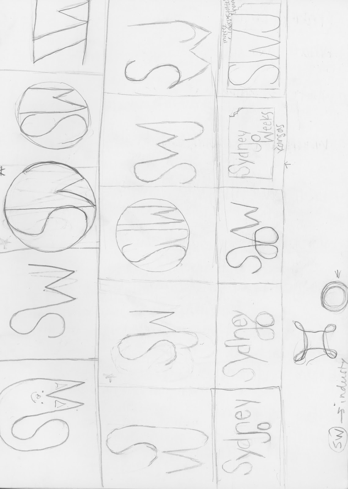
My Logo

Logo
This logo represents me and who I am which is a gymnast. The sideways stands for the first letter of my first name;Sydney. Then the W is the first letter of my last name; Weeks. This is supposed to look like a gymnast doing a jump; the S being her legs and the W being her legs. I used her head (the circle) to represent control which is needed in gymnastics and also to represent a medal; striving for perfection which is another thing a circle can be. The colors I chose are the colors of the gym I go to; Pinnacle Gymnastics. The reason I chose the font I did was because it looked modern and the S wasn't too curved so that it didn't look like her legs were broken and so her hands didn't have serifs on them.Tuesday, January 20, 2015
Color Wheel
Color Wheel
Some things I learned about color during these projects are all of the colors, their names, and what type of color they are. I learned the three different types of colors; primary(red, yellow, and blue), secondary (orange, green, and purple), and tertiary (yellow-orange, red-orange, red-violet, blue-violet, blue-green, yellow-green). I also learned some of the tools in Illustrator like how to change the color of things, how to create shapes and perfect shapes. Some other tools I learned were how to make my art board larger or smaller and how to type words with different typefaces and colors.


Subscribe to:
Comments (Atom)