
Monday, May 9, 2016
Movie Poster
Individual Project
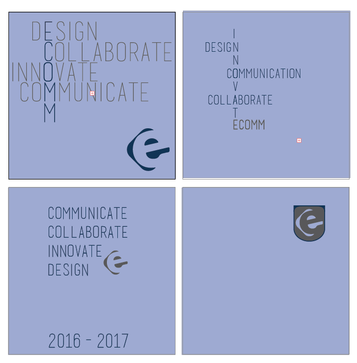


Throughout this semester, we've been working on a project all our own. We had to think of something to create using things that we've learned all throughout this year. I decided to create t-shirts for Ecomm next year. I wanted to make something that would appeal to guys, girls, and teachers but would also be modern enough to wear for years to come. I got my inspiration from sorority and fraternity shirts with the type on paths. I tried to emphasize the four main points of Ecomm: communicate, collaborate, innovate, and design. I chose to incorporate these words to take up more space and make the shirt seem full while also modern and sophisticated. It took me many tries to come up with my final project and many fails as well.The font I chose to use was called basic title font. This was also the font I used on my magazine cover. I really like this font because it can be modern, sophisticated, but fun at the same time.
Another aspect I chose to incorporate in my shirts was the Ecomm logo. I thought it was very important seeing as these are shirts for Ecomm. I'm very excited about how this turned out and hope that it will possibly be the shirt that's used next year. If I were to change something, however, I probably would try to ask for more opinions and go more outside of the box when thinking about ideas and designs. I think that it turned out a lot better than I previously anticipated though. I'd definitely do a project like this again because it required us to come up with products on our own and then ask for input on them. It also made us have to use our previous knowledge and solve any problems we had on our own.
Creative Team Project


The last project we did was a creative team project. We got to choose a partner and create a toy all our own. I really liked this project because it allowed us to collaborate with each other and create something that is completely different than any one else's, The toy we decided to make was a doll that transforms into a mermaid when it comes in contact with water. We got the idea from an old show called H2O which was about these 3 teenage girls who became mermaids when they touched water. It was really fun to make this package because we got to create not only the toy but also a color palette, type palette, logo, and package. We chose to use the orange and blue from the H2O cover and pink to ad another color. Overall, I'm very happy about how this project turned out and would definitely do it again. If I could change one thing, however, I probably would add more design elements to it to make it look a little more intriguing.
ACT II Detention
This is the second act of the short film we created in video. In this act the students begin to search for Mr. Cooper. As they break off and go their own ways they get killed off one by once. Becky, Alex, Brad, Jack, Heather, and Stacy all slowly get killed by a mysterious figure. Who it is? You'll have to watch Act III to find out.
This act was really fun to film because our story was brought to life. We got to incorporate different scripts and shots within it which made it interesting to film. There were also different people we got to work with which gave us a different work experience with different people. Overall, I'm very proud of this act and am excited to film Act III.
Wednesday, May 4, 2016
ACT I Detention
At the beginning of the semester we started creating a short film. The film that Angie and I came up with was Detention. 8 students are in detention when their teacher gets a call that he needs to take. This exhilarating thriller will keep you on your toes and wanting to keep watching.
Magazine Cover

Overall, I'm very proud of my magazine and would definitely do this project again.
L/I/P/Z Package


If I were to redo this project, I would make sure I had the layers correct and the dieline/bleed so that I wouldn't have to redo it 20 times. However, I was pretty happy with how our package turned out and would definitely do this project again.
Subscribe to:
Posts (Atom)